Pages like this remind me that there is a certain art to doing comic book panels. I have gone into long discussions with other comic book artists on how the arrangement of panels can be really important to the story.
Sometimes I feel like people take it too far, with every page full of twisted panel shapes or someone breaking the boundaries of the panel, like if you don't do that the comic won't be dynamic. To me panels should be more like text: if you bold everything then... well, nothing stands out. And there's more to the art of designing comic panels than simply adding a diagonal line through the panel box.
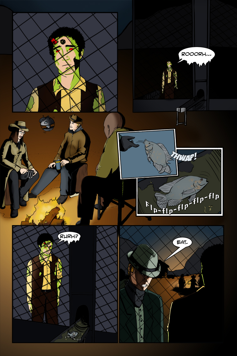
I'm no master at drawing comic panels, in fact I'm probably still more of an eager student. But nevertheless, I still try to play with the idea of how comic panels are arranged and shaped, whether it's panels that convey action, fighting, excitement (like some of Cary Nord's"Conan" work) or the simple - yet strong - panels you see in the Watchmen comic (example). With Zombie Ranch I'm often keeping to a simple, straightforward style I feel appropriately matches the story, but there are certainly times like this one where I can get more creative. Clint wanted some emotional drama expressed with minimal words and I hope I achieved that.
One day I hope to be advanced and experienced enough with all this that I can write a tutorial or give tips on paneling, since one thing I've noticed is that while there's plenty of books on how to draw comic art, there's almost none on how to arrange it. Until then, I'll continue to learn.
Zeke just isn’t quite grasping the concept that he is not exactly human anymore, is he? Poor Frank too. Ah … zombie ranching is a tough life all around I reckon.
The panels look great! I agree with you Dawn; many comics push the boundaries a little too far when trying to make their “panels” look “different”. In fact, there have been some which I can’t follow because they get too crazy with the panels (or lack of them). When I run across those, I generally give them a pass. If it’s a good story and they only get crazy once in a while, I might stick it out, but usually don’t bother.
OTH, it has been my experience as a reader, that most of the best on-line comics stick to a fairly standard pattern most of the time. When it is neecessary, breaking the standards works good … in a good comic. A good example is “Gunnerkrigg Court” – an excellent comic with a pretty standard layout most of the time, that will break the mold when needed. “Dominic Deegan; Oracle for Hire” is another good example.
Not sure if I’d taken the time to mention it before, but I had worked through your entire comic a while back. Excellent work! Excellent story line so far. And I love your artwork. Especially how you change from the simple style you use in the “infomercial” panels (I guess that’s a good word for them?) to your regular story-telling style. Thank you so much for your hard work!
BarnOwl, I have to say “I’m a fan of your avatar”. Now that I’ve gotten that out of the way.
I have also come across comics that I couldn’t read because the panels were so crazy and always trying to be super dynamic. I blame all those tutorial books with titles like “How to draw dynamic comics” or “Extreme comic creating”. Everyone wants to be the next Jim Lee or hip new manga.
I wanted to give this comic a little bit of a simple feel. That sort of good old western movie kind of vibe that had camera angles to get cowboy’s subtle emotions on their face. Though it’s still a comic and I don’t want it to feel like they’re film stills just copy and pasted on the page. But all in all, tilted panels and extreme panels are used sparingly because of this story and should for many comics. Otherwise you will be like Battlefield Earth with all its tilted camera angle shots.
@BarnOwl – And thank you for the nice comment on my art. I feel that I’ve improved, but still feel like I have a lot to learn. Which I guess is the life of the artist. Atleast for me, I always see room for improvement.
Also thanks for the compliments on the story line. For me the overuse of any “extreme” technique is going to be desensitizing after awhile, not just in paneling but in every aspect of art. If you want to punch up a certain moment or sequence, you have to leave room to swing.
For instance, from the beginning I’ve made a conscious choice to limit the gore on display, when a lot of zombie comics (and movies) revel in it. In an offering like Brain Dead/Dead Alive that’s great, because the violence isn’t supposed to have any real weight to it, it’s just part of the fun. But if you want people to have a deeper reaction, you take a lesson from creators like the Coen Brothers and dole it out in sparse, stark moments that imprint on your audience’s brain.


11 thoughts on “79 – Cold Comfort”
Clint
Looks like Frank’s still having a not-so-great night…
Barn0wl
Zeke just isn’t quite grasping the concept that he is not exactly human anymore, is he? Poor Frank too. Ah … zombie ranching is a tough life all around I reckon.
The panels look great! I agree with you Dawn; many comics push the boundaries a little too far when trying to make their “panels” look “different”. In fact, there have been some which I can’t follow because they get too crazy with the panels (or lack of them). When I run across those, I generally give them a pass. If it’s a good story and they only get crazy once in a while, I might stick it out, but usually don’t bother.
OTH, it has been my experience as a reader, that most of the best on-line comics stick to a fairly standard pattern most of the time. When it is neecessary, breaking the standards works good … in a good comic. A good example is “Gunnerkrigg Court” – an excellent comic with a pretty standard layout most of the time, that will break the mold when needed. “Dominic Deegan; Oracle for Hire” is another good example.
Not sure if I’d taken the time to mention it before, but I had worked through your entire comic a while back. Excellent work! Excellent story line so far. And I love your artwork. Especially how you change from the simple style you use in the “infomercial” panels (I guess that’s a good word for them?) to your regular story-telling style. Thank you so much for your hard work!
Dawn
BarnOwl, I have to say “I’m a fan of your avatar”. Now that I’ve gotten that out of the way.
I have also come across comics that I couldn’t read because the panels were so crazy and always trying to be super dynamic. I blame all those tutorial books with titles like “How to draw dynamic comics” or “Extreme comic creating”. Everyone wants to be the next Jim Lee or hip new manga.
I wanted to give this comic a little bit of a simple feel. That sort of good old western movie kind of vibe that had camera angles to get cowboy’s subtle emotions on their face. Though it’s still a comic and I don’t want it to feel like they’re film stills just copy and pasted on the page. But all in all, tilted panels and extreme panels are used sparingly because of this story and should for many comics. Otherwise you will be like Battlefield Earth with all its tilted camera angle shots.
Dawn
@BarnOwl – And thank you for the nice comment on my art. I feel that I’ve improved, but still feel like I have a lot to learn. Which I guess is the life of the artist. Atleast for me, I always see room for improvement.
Clint
Also thanks for the compliments on the story line. For me the overuse of any “extreme” technique is going to be desensitizing after awhile, not just in paneling but in every aspect of art. If you want to punch up a certain moment or sequence, you have to leave room to swing.
For instance, from the beginning I’ve made a conscious choice to limit the gore on display, when a lot of zombie comics (and movies) revel in it. In an offering like Brain Dead/Dead Alive that’s great, because the violence isn’t supposed to have any real weight to it, it’s just part of the fun. But if you want people to have a deeper reaction, you take a lesson from creators like the Coen Brothers and dole it out in sparse, stark moments that imprint on your audience’s brain.
Norman
Another fan here, loving the story and art. This panel has me ready to cry…
Keep up the great work
Norman
Clint
Norman, I’m glad to hear we managed to get enough emotion into this to provoke some reactions like yours. Thank you for reading!
Connie
He looks so sad and yet so oblivious to why he’s sad. At least, that’s my interpretation.
Dawn
Connie, you have made this artist very happy. 😀
nuit56
poor zeke ;___; this part made me cry, i want them to be friends soooooo bad!!!
btw i love how ‘clean’ your work is
Calendar
BlueSky Latest Posts
Writer’s Blog Archives