


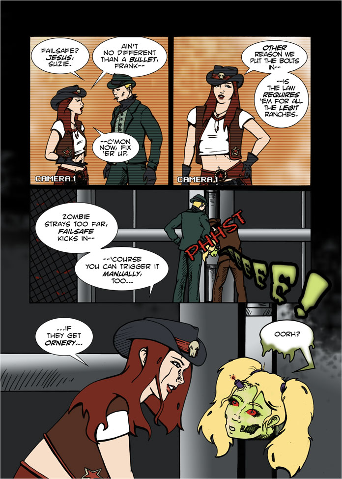
Last week I blew off steam ranting about some of the behind-the-scenes work involved in getting a webcomic from digital to print, particularly in terms of how different printers have their different requirements. But although I love to wallow in words, some of you out there are probably more visual learners (my wife would be one of those, naturally). So let’s use this time together to showcase one of the pages that had to go through the most tweaking during the process. On this site the original exists as page 10 if you’d like to reference that. The first thing I did when we hit our Kickstarter goal was a pass through to update the lettering, like so (click to enlarge):
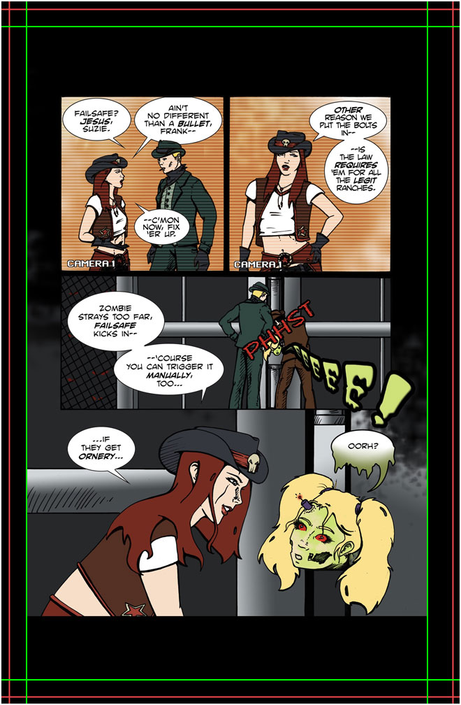
 Now, for whatever reason lost to the mists of time, this particular page had a physical printing size that was slightly over 7 inches by 10 inches at its 300 DPI base resolution. Our intended size for the trade paperback was 6.75 x 10.25, which meant that as is the image was a bit shorter and wider than needed.
But “as is” is a rarity, because now we got the specifications from our Kickstarter printer, and he wanted a quarter inch of bleed all the way around, with the “safe area” a quarter inch in from that. That meant we had to extend our canvas to 7.25 x 10.75, which left empty space unless we resized the art.
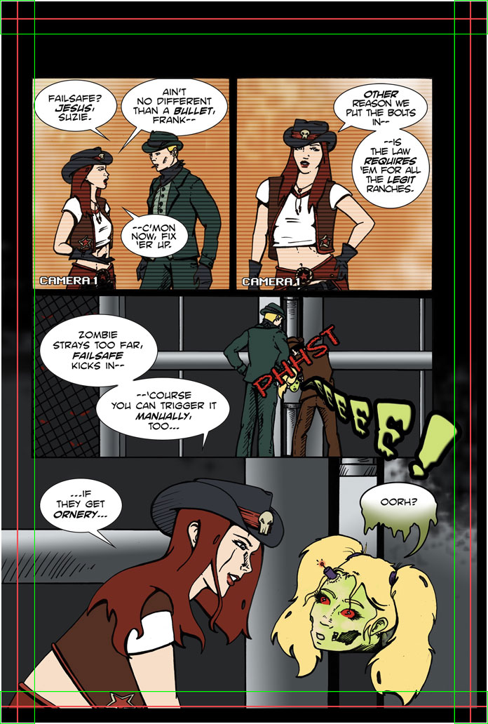 The white border is an addition so you can see the edges more clearly, and red and green lines have been added by me so you can see where the trim and safe areas are. The goal is to get all your most important “live elements”, like text, in the safe area or very close to. Meanwhile anything outside the red lines is getting cut, which meant the art in the last panel should extend to the end of the page, or at worst there would be a very small black line, which I was okay with and told our printer so, and he was willing to work with that. Awesome. But we’ll come back to this later.
You’ll also notice another pass on some of the page features, like ditching the “blur” on the zombie shriek which I didn’t feel would look good in print, and altering the balloon stem for “OORH?” to be a more organic curve.
This page also represents a revision done after figuring out how much space we should allow for a central “gutter” in a 200 page book, since we’d never done a project like this before. So when we got our first proof back we decided that we would see about adjusting the pages to give another quarter inch of space on the interior sides. This page being a left-hand page, that meant moving things in on the right, though that wasn’t as big a change here as it was for some others. All good. The above was the final approved file sent off in the packet, and by design is off-center compared to what you’d see in the digital PDF.
But since we also were having an eye out towards future distribution (not to mention getting a discount on our ISBN purchase), I then took the exact same packet and uploaded it to Create Space. Actually no, that’s not quite accurate. First I had to tweak the canvas of 196 interior pages to fit Create Space’s guidelines, where the bleed trim was 0.125″ on the outer edges. The safe area was still a quarter inch in from that, and the interior just needed a straight up half inch, so it was pretty close to what I already had. A little bit of trimming, and off went the file! And it got rejected. Not enough bleed. Not enough margin.
Okay, fine, I admit I’d been a bit laissez-faire in my first pass, so I went back and tried to shift the pages to fit their template as best as I could. And was rejected again. This was the point I called them up and tried to just see if I could do some sort of “I know what I’m doing” override. No dice. But the lady I talked to did at least clue me in to the fact that if Create Space sees so much as a sliver of black or white as a border in the trim area, they reject the page (and thus the file). Which means if you have any pages such as this one where art goes to the edge, you’ve got trouble, especially if it wasn’t designed to go the edge on all sides. I may have been able to tell our independent printer that a bit of white or black ending up on the edges was fine, but now I was dealing with an impersonal monolith, with Policies and Procedures and Requirements. Full stop.
So this became a serious pickle of a page. Enlarging the art would be the easiest solution, but getting it big enough so that the bottom reached the page edge could lead to a rejection for text being outside the safe area (for all I knew they included sound effects in their definition of “text”). I could cheat and just resize it a little bit to cover the sides and then move it down since the black on top was easy to extend, but that ended up looking weird and imbalanced.
In the end I decided to shrink the page down so that everything fit within Create Space’s safe margins, and centered the image as best I could.
 The good news is this sort of decision was a rarity, and about as crazy as it got in terms of having to reformat the content — so I’m still confident the Create Space version should represent the story to great satisfaction. But yeah, there’s a visual illustration of some of the pains in the keester I’ve been going through lo these past few months. If you decide to go down the same road in the future, be prepared!