


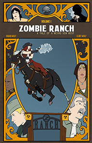
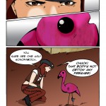
An online webcomic about a group of cowboys/cowgirls and their Zombie herd.
An online webcomic about a group of cowboys/cowgirls and their Zombie herd.


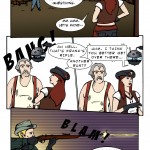
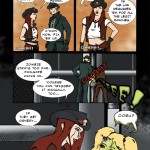
#26. 24 – When Advertisements Attack
49 Apr 07, 2010
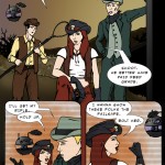
#25. EPISODE TWO
50 Apr 06, 2010
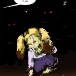
#24. 23 – Day In The Death (END OF EPISODE 1)
48 Mar 17, 2010
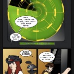
#23. 22 – Simple Math
45 Mar 10, 2010
#22. 21 – In The Blood
47 Mar 03, 2010
#21. 20 – Man Down
44 Feb 24, 2010
#20. 19 – Shots Fired
48 Feb 17, 2010
#19. 18 – Ugly Little Bugger
51 Feb 10, 2010
#18. 17 – Reduce, Reuse, Recycle
50 Feb 03, 2010
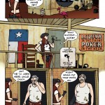
#17. 16 – A La Cart
49 Jan 27, 2010
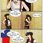
#16. 15 – All Good
47 Jan 20, 2010
#15. 14 – Busted
45 Jan 13, 2010
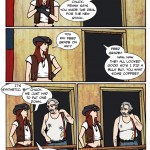
#14. 13 – First Impressions
47 Jan 06, 2010
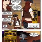
#13. 12 – Warning Signs
48 Dec 23, 2009

#12. 11 – Nuthin’ But Meat
52 Dec 09, 2009
#11. 10 – Ornery Critters
48 Dec 02, 2009
#10. 09 – Runt Of The Litter
43 Nov 25, 2009
#9. 08 – What A Drag
49 Nov 18, 2009
#8. 07 – Off He Goes
49 Nov 11, 2009
#7. 06 – Don’t Hurt Them Much
45 Nov 04, 2009
We'll be at Pasadena Comic-Con this coming Saturday, May 24th. It usually happens in January but was delayed due to the wildfires since the Convention Center ended up being a refuge for the displaced -- fair enough considering our own close call with being displaced!
We should be at D2 in the Main Ballroom section, which is in light pink, under Clint & Dawn Wolf.

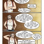
One thought on “544 – Hanker For A Hunker”
Dr. Norman (not a real doctor)
That feels like my life with my eyes these days …
“These goggles don’t got no magnification on ’em”