Two weeks ago I wrote about the ideal of having artwork that meshes perfectly into the storytelling of comics, and how I felt the right choice and arrangement of panels was an inescapable part of that. At that time I included some scans of J.H. Williams III’s artwork to illustrate the possibilities, but this time around I want to take one single page and get really (over?)analytical about the choices that were made.
It may seem strange but I find this to be one of the joys that progressed out of working on a comic of my own. When you’re figuring out how to tell your own story, you really start to become aware of the techniques others are using to tell theirs, and it provides a new level of appreciation for both the comics you re-read and the ones you discover for the first time. One of these recent discoveries for me was
The Flash #1, one of the slew of titles in the New 52 line-up of the DC reboot.
By and large, I was uninterested in or even just outright bleah about DC comics trying to reinvent and relaunch their signature heroes, although having grown up a Marvel brat I didn’t have quite the visceral investment of those that were really familiar with the characters. Superhero comics in general were something that had blended into a generic state, especially visually, that I found to be uncompelling, and the reboot didn’t look prepared to change that much. Then, in one of my occasional browsings of comics news sites, I ran across a review of
The Flash, and a scanned page from the issue that unexpectedly seized my attention in a big way.
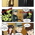
Without further ado, let me share that page with you now:
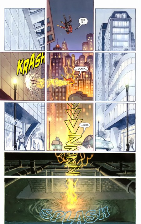
I went out and bought the comic almost solely based on this page alone (plus a quick skim at the comic book store to confirm it wasn’t a fluke).
The Flash #1 is an issue I felt was well worth its $2.99 pricetag because of visual storytelling like this. It’s a great example of how the work in a superhero comic doesn’t have to be stale and generic. Francis Manapul and Brian Buccellato went above and beyond with this layout. Let’s break it down (you can click on the image to open it in a new tab/window while you’re reading this).
- Note that this page is composed of a single, contiguous environment. A city street, its surrounding buildings, and the sewer beneath. The action and dialogue here is actually quite simple, script-wise. The Flash has just fallen out of a helicopter along with one of the armored thugs he was chasing. As he falls, he throws the thug through the glass window of a building, then plummets to a crash landing. Aside from some sound effects, the only dialogue is: “This is gonna hurt.”
- Given all that, there was a choice here where the scene could have been rendered without any panel dividers, or very few. But panels = time. The more panels on a page, the more compressed time becomes, increasing the urgency of each action depicted. Urgency was a key storytelling component of this page. But most of the action takes place along a very narrow section of the actual image, so if you’re going to display a big, single background, aren’t some of those panels going to end up showing unnecessary filler? Yes they are, and so…
- The “non-action” parts of the grid are not only reduced in size, but bled of color. Not completely, so you know it’s not a mistake of printing, but it does serve to mask the presence of the contiguous background image at a casual glance. Your eyes go first right where they’re supposed to, the top middle. But wait, there’s more…
- Although it may not be obvious from the scan, there are three panels that extend all the way through the bleed area to the edge of the comic page. This occurs at the middle top, the middle left, and the entirety of the bottom. Notice this also corresponds to the presence of full color, and of action. Flash’s entry point from above (falling) is clearly defined, and the “exit point” of the thug is given weight by having the panel shifted outward by the impact. These are given a tighter focus than the bottom, where the final ‘SPLASH’ impact is spread out to overflow downwards in a less sharpened form, letting the kinetic energy of the sequence fade away.
- Similarly, splitting the sewer area into two panels of equal horizontal space, but unequal vertical space, is another deliberate choice. What you get with this is a sense of the pancaking ‘hit’ of the initial contact with the street, followed by the subsequent descent into the water having a more anticlimactic feel that’s backed up by the splash being much less ragged and violent than might otherwise be expected.
- Finally, we have the choice of how to display the lone line of dialogue: in… between… moments. There is a real sense of velocity here because there’s no time to say anything lengthy. There’s not even time to say a short sentence in the space of a single panel, it takes three of them to utter what at most would be two seconds of words. This neatly follows the idea of a page where the protagonist descends from top to bottom at a rate of hundreds of feet per second, and is most likely also why the sound effect of the breaking window is isolated and unfinished–Flash hits the street before the glass has stopped tinkling.
By setting all this up, Manapul and Buccellato were able to split what could’ve been left as a lazy splash page (last panel sound effects notwithstanding) into 11 segments that tell the story far more effectively, even if five of the panels are there mainly for completeness and contrast. It’s a carefully crafted piece that draws your attentions exactly where they need to go and makes you feel exactly what you’re meant to feel, and does it so well we don’t need a lick of duo-specific narration from our hero explaining what’s happening or what he’s doing–and that’s important considering this is a situation happening so fast he should be running on instinct. That old silver age silliness of “Only a fraction of a second to react!” plays out exactly where it should for a piece needing that frame of immediacy–unspoken, unthought, except as a given to the actions occurring; a feature especially important to a superhero like The Flash where speed should be a major theme of the physicality.
There were several impressive moments like this in the comic, and I highly recommend picking it up if you want to experience some enthusiastic pros at work with great visual instincts on how to guide a reader’s eye. I didn’t need to be a fan of The Flash to know that these guys are, and that they’re having some great fun with the opportunity they’ve been granted to not only reboot a classic hero, but show the storytelling core of that hero in a way only comics can do.
In any case, I hope this article explained a bit more about my views on how all the aspects of a comic’s presentation can contribute to the tale being told. These are lofty heights we probably only rarely achieve with
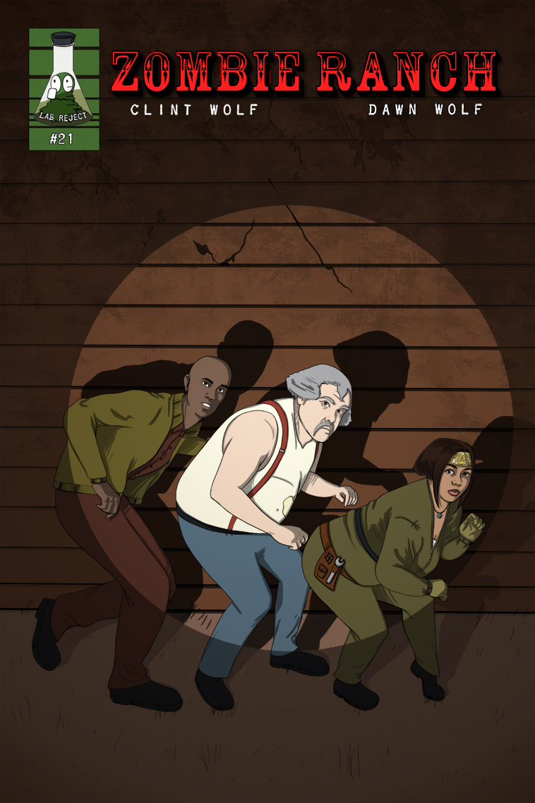
Zombie Ranch (if ever) but they’re something I feel important to keep in mind and strive for as a creator. When it’s done right, it’s the kind of work that really inspires, and makes the medium shine.


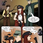
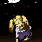
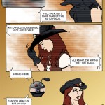
One thought on “557 – Rattle And Hmmm”
Raznaak
Oh, these bastards XD