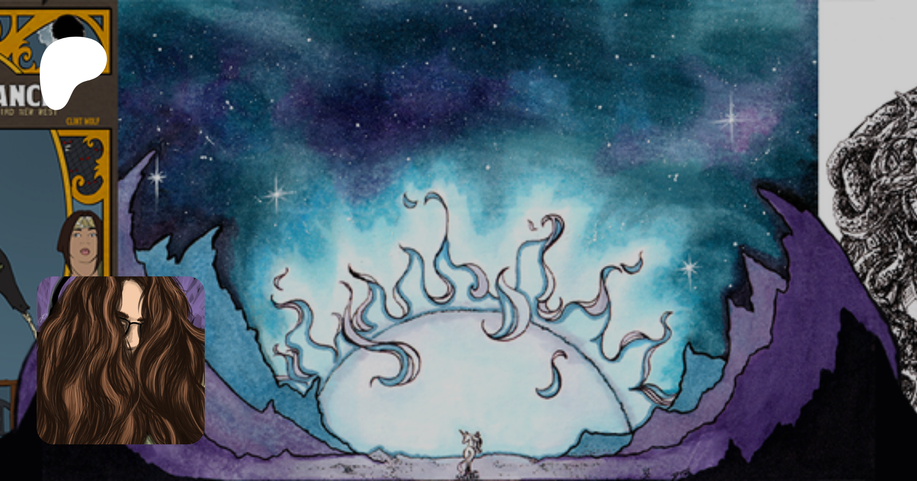


Fight scenes are a staple of fiction, the end expression of conflict that has escalated to the point of actual violence. By that view, they represent something that has gone completely out of control… yet the fiction creator doesn’t have the luxury of just “letting it happen.” In any medium there are boundaries that have to be observed, and comics are no exception. Two guys sitting on a couch debating the latest videogame controversy is arguably rather easy compared to portraying those same two guys rolling around the room trying to bash each other’s heads in.
Sure, there’s something to be said for a fight being naturally exciting compared to talk, but it’s still something that requires thought and effort in presentation. I don’t do storyboarding for every page of Zombie Ranch but fights are something where it feels like a mandatory part of the process, because here you are trying to get this conflict across in a limited, bounded space, and you’re trying to get the action and storytelling beats you need presented in a way that the audience can not only follow but impart a momentum to them. The “gutters” and the concepts of closure come into stark focus as you struggle to find that Goldilocks balance somewhere between too much and too little, and do what you can to guide the reader’s eye so that Punch A is clearly understood to happen before Reaction B.
For instance, in the western mode of reading we go top to bottom and left to right, and so adhering closely to that format will hopefully lend itself to proper order and sense of momentum. Going against it can look odd. Originally I wanted Oscar to get tackled off to the left of the wagon, with an impact marker as they hit the ground that would point downwards to the next row of panels. Fancy. But you put that on a page in a sequence and, because of the left-to-right default, it might look weirdly like they were rising back onto the wagon instead. Switch it around, and the impact marker now points to the bottom right instead of bottom left where it should. So, we ended up abandoning that. Sometimes you can play around with the paneling — for instance more and smaller panels tend to punch up the sense of urgency, and skewed panel borders impart a sense of imbalance that can be usefully dramatic — and sometimes you just end up playing it straight, whereupon I have to remind myself that Watchmen was able to present several memorable fight scenes without ever straying from its grid pattern. If getting too fancy is getting in the way of the storytelling rather than enhancing it, well, I’ve learned to swallow pride and let a more plain layout carry the day. Fights are messy. But it’s up to you and your creative partners to try not to make a mess of them.