It’s been a while, so let me ask: Did we get a reason for him to WANT Susie dead? Not to backseat, but if we didn’t, I’m worried were about to move into “Stupid Evil” territory. Now, stupid happens, don’t get me wrong. It’s not bad storytelling for that to be the case here.
You’ve just done a good job NOT having that be a driving factor, so the “Kill off the stars of my successful reality TV show.” seems shortsighted, otherwise. Oh, I guess I could be mistaken about the in-story reality TV show’s success. Like, if the company behind them is losing money, or they think a change in management at the ranch would make the whole thing more popular/profitable, then I can see the above scenario happening as well.
I REALLY think I’m just forgetting something important, but that I don’t have time to deep dive to remind me of, hence the comment. >_<
It certainly has been stretched out over quite a while, but there have definitely been hints from quite near the beginning that whoever is running the reality TV show definitely wants her dead.
Yeah it’s fair to not remember since it’s been a hot minute (many, many minutes) but if you feel like a refresher the most relevant bits would be the beginning of Episode 8 and the end of Episode 15. We haven’t explicitly spelled out exactly what The Exec means by his “side hustle” or who was on the other end of that phone call, though.
I’m hoping that when the whole thing is eventually available it will make sense, or at least enough sense to have hung this narrative on.
Otaku
Thanks for the replies, Deoxy and Clint. Yeah, I’d totally forgotten about those things. Good to know!
There’s still 3-5 people on her side that might be planning something. This guy is a megalomaniac with a god complex, so letting him think he’s the sharpest tool in the shed sets him up for a fall. Everything depends on those cameras, and I suspect their little stop over by the charging coffins had something to do with her actual plan, not the one the a-hole thinks it is.
Really enjoyed the opening of Zombie Ranch. I like the combination of the western setting with the zombie concept, it gives the story a really distinctive atmosphere. I’m a freelance illustrator and animator, and I’d be interested in seeing how some of these scenes could translate into motion, especially as a short animated teaser or character scene.
If you’re ever interested in something like that, you can reach me here:
It’s been about 15 years since I started being “in the business” — if you can say so about someone whose business consists of two people doing their best with self publishing a work of fiction. Still, I’ve learned enough to know what might be considered some best practices, and with that comes a recognition of what the joke (troll?) is with the sticker image below.
As a layperson comics reader, would you see anything wrong with this? Maybe, maybe not. But it’s intentionally designed to trip the twitch switches of pro or semi-pro letterers. A sampling:
1) Left-justified text, meaning the paragraph is straight up and down on the left side but varies on the right. It’s standard in writing novels and such but tends to look very odd within the word balloons that are the standard method of delivery for comics dialogue. That’s why the convention is to center the text and ideally go for a “diamond” shape where possible to complement the balloon that contains it.
2) Speaking of which, the word balloon (while nice-looking on its own) is way too big for the text inside. It’s something I still wrassle with occasionally but you try to keep it from being too tight or too loose with regards to whitespace. This paragraph is not only left-justified but not even centered within the balloon itself.
3) Lack of all caps for your dialogue isn’t a big deal these days, but having three capital letters in the same sentence is… oof. As a bonus one of the caps is a crossbar capital “I” which editors would often consider a no-no to use in comics at all unless it’s on its own or part of an apostrophe situation.
4) Comic Sans is the font choice. This might be the least sinful overall to me, in fact when we first started the comic we were using it and you can still see it in the first issue or so. But there are a lot of people who really, really don’t like it and consider it a sign of ignorance and amateurism. What’s been explained to me is that it’s not very well set up as a font design, which might be why there’s also the problem of the “g” in “Lettering” brushing up against the “a” in the next line. That could also be a line spacing problem though, everything just looks cramped.
Anyhow, lack of these lettering stylings is hardly a criminal act, and most are honestly there for the purpose of making comics easier to read, so if your audience can read it then so be it (barring of course an editor you need to get things past). I’ve seen all sorts of webcomics do all sorts of things and the above at least is still legible, even if it makes my brain itch. But if you truly do have a passion for comic book lettering, it’s worth figuring out some of the basics even if you plan to break them later on.



9 thoughts on “558 – Cotton Clad Calamity”
Raznaak
Yup, he’s a bastard XD
Dr. Norman (not a real doctor)
Are those pajamas available in XXXL in the gift shop?
Otaku
It’s been a while, so let me ask: Did we get a reason for him to WANT Susie dead? Not to backseat, but if we didn’t, I’m worried were about to move into “Stupid Evil” territory. Now, stupid happens, don’t get me wrong. It’s not bad storytelling for that to be the case here.
You’ve just done a good job NOT having that be a driving factor, so the “Kill off the stars of my successful reality TV show.” seems shortsighted, otherwise. Oh, I guess I could be mistaken about the in-story reality TV show’s success. Like, if the company behind them is losing money, or they think a change in management at the ranch would make the whole thing more popular/profitable, then I can see the above scenario happening as well.
I REALLY think I’m just forgetting something important, but that I don’t have time to deep dive to remind me of, hence the comment. >_<
Deoxy
It certainly has been stretched out over quite a while, but there have definitely been hints from quite near the beginning that whoever is running the reality TV show definitely wants her dead.
But I certainly don’t recall any reason why.
Clint
Yeah it’s fair to not remember since it’s been a hot minute (many, many minutes) but if you feel like a refresher the most relevant bits would be the beginning of Episode 8 and the end of Episode 15. We haven’t explicitly spelled out exactly what The Exec means by his “side hustle” or who was on the other end of that phone call, though.
I’m hoping that when the whole thing is eventually available it will make sense, or at least enough sense to have hung this narrative on.
Otaku
Thanks for the replies, Deoxy and Clint. Yeah, I’d totally forgotten about those things. Good to know!
Evervigilant
Seems about time for the two people who aren’t there to make a surprise entrance as the ace Susie didn’t even know she had.
Scarsdale
There’s still 3-5 people on her side that might be planning something. This guy is a megalomaniac with a god complex, so letting him think he’s the sharpest tool in the shed sets him up for a fall. Everything depends on those cameras, and I suspect their little stop over by the charging coffins had something to do with her actual plan, not the one the a-hole thinks it is.
lyra
Really enjoyed the opening of Zombie Ranch. I like the combination of the western setting with the zombie concept, it gives the story a really distinctive atmosphere. I’m a freelance illustrator and animator, and I’d be interested in seeing how some of these scenes could translate into motion, especially as a short animated teaser or character scene.
If you’re ever interested in something like that, you can reach me here:
IG: eve_verse_
Email: [contact.lilaclines@gmail.com](mailto:contact.lilaclines@gmail.com)
Discord: Lyralilac_
Latest Comics
#80. 76 – Beware Of False Profits
74 May 25, 2011
#79. EPISODE FOUR
61 May 23, 2011
#78. 75 – Dead Man’s Hand (END OF EPISODE 3)
55 May 11, 2011
#77. 74 – The Matchmaker
57 May 04, 2011
#76. 73 – Signal To Noise
41 Apr 27, 2011
#75. 72 – Dinner Is Served
37 Apr 20, 2011
#74. 71 – Endangered Specie
32 Apr 13, 2011
#73. 70 – Loose Talk
37 Mar 30, 2011
#72. 69 – Picture Perfect
40 Mar 23, 2011
#71. 68 – Z Is For Zane
54 Mar 16, 2011
#70. 67 – Where’s The Beef?
43 Mar 09, 2011
#69. 66 – Talking Crap
46 Mar 02, 2011
#68. 65 – Medicinal Purposes
37 Feb 23, 2011
#67. 64 – Rancher’s Intuition
42 Feb 16, 2011
#66. 63 – Trust Issues
54 Feb 09, 2011
#65. 62 – Home on the Range
55 Feb 02, 2011
#64. 61 – Let There Be Light
43 Jan 26, 2011
#63. 60 – Got Your Goat
44 Jan 19, 2011
#62. 59 – Over a Barrel
45 Jan 12, 2011
#61. 58 – Finger Lickin’ Good
40 Dec 29, 2010
Latest Chapters
Episode 22
Episode 21
Episode 20
Episode 19
Episode 18
Episode 17
558 – Cotton Clad Calamity
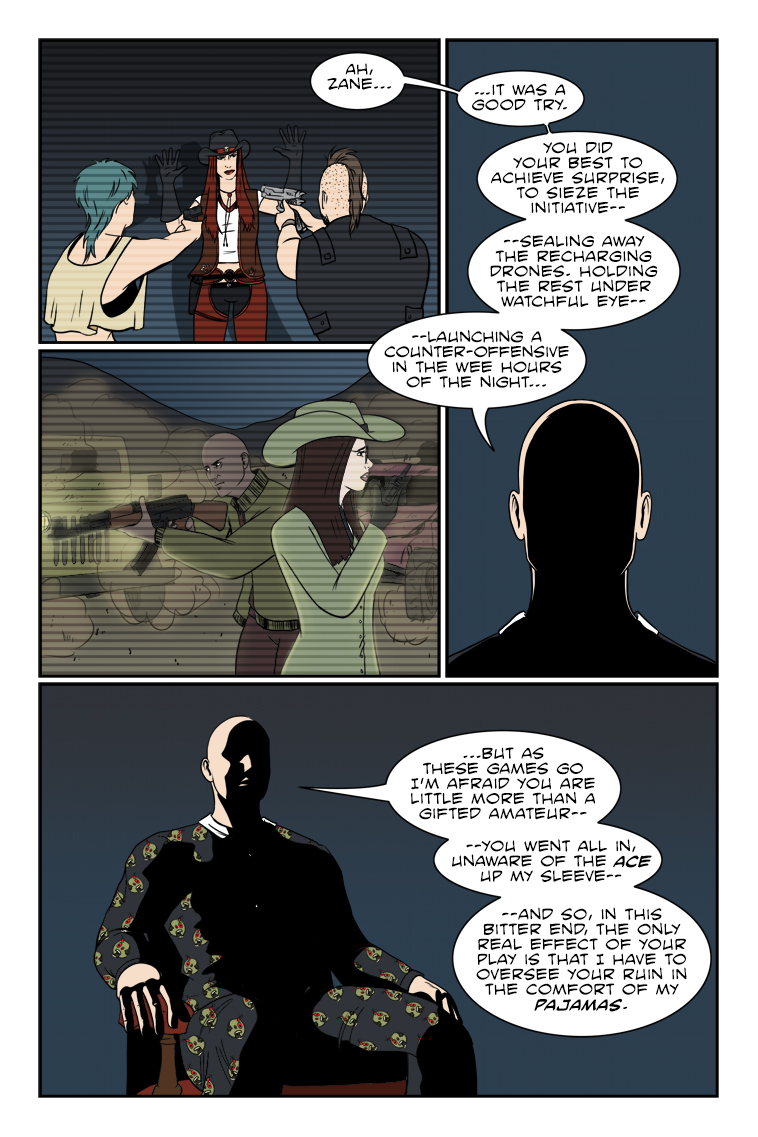
What would you call this? Armchair assassination? Merk-from-home?
Well, Suzie ain't dead (or undead) quite yet, so we'll just have to see if his gloating is justifiable.
The lettering of the law…
It’s been about 15 years since I started being “in the business” — if you can say so about someone whose business consists of two people doing their best with self publishing a work of fiction. Still, I’ve learned enough to know what might be considered some best practices, and with that comes a recognition of what the joke (troll?) is with the sticker image below.
As a layperson comics reader, would you see anything wrong with this? Maybe, maybe not. But it’s intentionally designed to trip the twitch switches of pro or semi-pro letterers. A sampling:
1) Left-justified text, meaning the paragraph is straight up and down on the left side but varies on the right. It’s standard in writing novels and such but tends to look very odd within the word balloons that are the standard method of delivery for comics dialogue. That’s why the convention is to center the text and ideally go for a “diamond” shape where possible to complement the balloon that contains it.
2) Speaking of which, the word balloon (while nice-looking on its own) is way too big for the text inside. It’s something I still wrassle with occasionally but you try to keep it from being too tight or too loose with regards to whitespace. This paragraph is not only left-justified but not even centered within the balloon itself.
3) Lack of all caps for your dialogue isn’t a big deal these days, but having three capital letters in the same sentence is… oof. As a bonus one of the caps is a crossbar capital “I” which editors would often consider a no-no to use in comics at all unless it’s on its own or part of an apostrophe situation.
4) Comic Sans is the font choice. This might be the least sinful overall to me, in fact when we first started the comic we were using it and you can still see it in the first issue or so. But there are a lot of people who really, really don’t like it and consider it a sign of ignorance and amateurism. What’s been explained to me is that it’s not very well set up as a font design, which might be why there’s also the problem of the “g” in “Lettering” brushing up against the “a” in the next line. That could also be a line spacing problem though, everything just looks cramped.
Anyhow, lack of these lettering stylings is hardly a criminal act, and most are honestly there for the purpose of making comics easier to read, so if your audience can read it then so be it (barring of course an editor you need to get things past). I’ve seen all sorts of webcomics do all sorts of things and the above at least is still legible, even if it makes my brain itch. But if you truly do have a passion for comic book lettering, it’s worth figuring out some of the basics even if you plan to break them later on.
Calendar
BlueSky Latest Posts
Writer’s Blog Archives