It’s been about 15 years since I started being “in the business” — if you can say so about someone whose business consists of two people doing their best with self publishing a work of fiction. Still, I’ve learned enough to know what might be considered some best practices, and with that comes a recognition of what the joke (troll?) is with the sticker image below.
As a layperson comics reader, would you see anything wrong with this? Maybe, maybe not. But it’s intentionally designed to trip the twitch switches of pro or semi-pro letterers. A sampling:
1) Left-justified text, meaning the paragraph is straight up and down on the left side but varies on the right. It’s standard in writing novels and such but tends to look very odd within the word balloons that are the standard method of delivery for comics dialogue. That’s why the convention is to center the text and ideally go for a “diamond” shape where possible to complement the balloon that contains it.
2) Speaking of which, the word balloon (while nice-looking on its own) is way too big for the text inside. It’s something I still wrassle with occasionally but you try to keep it from being too tight or too loose with regards to whitespace. This paragraph is not only left-justified but not even centered within the balloon itself.
3) Lack of all caps for your dialogue isn’t a big deal these days, but having three capital letters in the same sentence is… oof. As a bonus one of the caps is a crossbar capital “I” which editors would often consider a no-no to use in comics at all unless it’s on its own or part of an apostrophe situation.
4) Comic Sans is the font choice. This might be the least sinful overall to me, in fact when we first started the comic we were using it and you can still see it in the first issue or so. But there are a lot of people who really, really don’t like it and consider it a sign of ignorance and amateurism. What’s been explained to me is that it’s not very well set up as a font design, which might be why there’s also the problem of the “g” in “Lettering” brushing up against the “a” in the next line. That could also be a line spacing problem though, everything just looks cramped.
Anyhow, lack of these lettering stylings is hardly a criminal act, and most are honestly there for the purpose of making comics easier to read, so if your audience can read it then so be it (barring of course an editor you need to get things past). I’ve seen all sorts of webcomics do all sorts of things and the above at least is still legible, even if it makes my brain itch. But if you truly do have a passion for comic book lettering, it’s worth figuring out some of the basics even if you plan to break them later on.


4 thoughts on “556 – Tip Of The Spear”
Honzinator
Hey, Blondie! – Tuco
Crazyman
That’s pretty cold; practical, but cold. 🥶
Clint
Suzie doesn’t consider herself a cold-blooded murderer, but she also doesn’t consider Huachucas to be people.
D
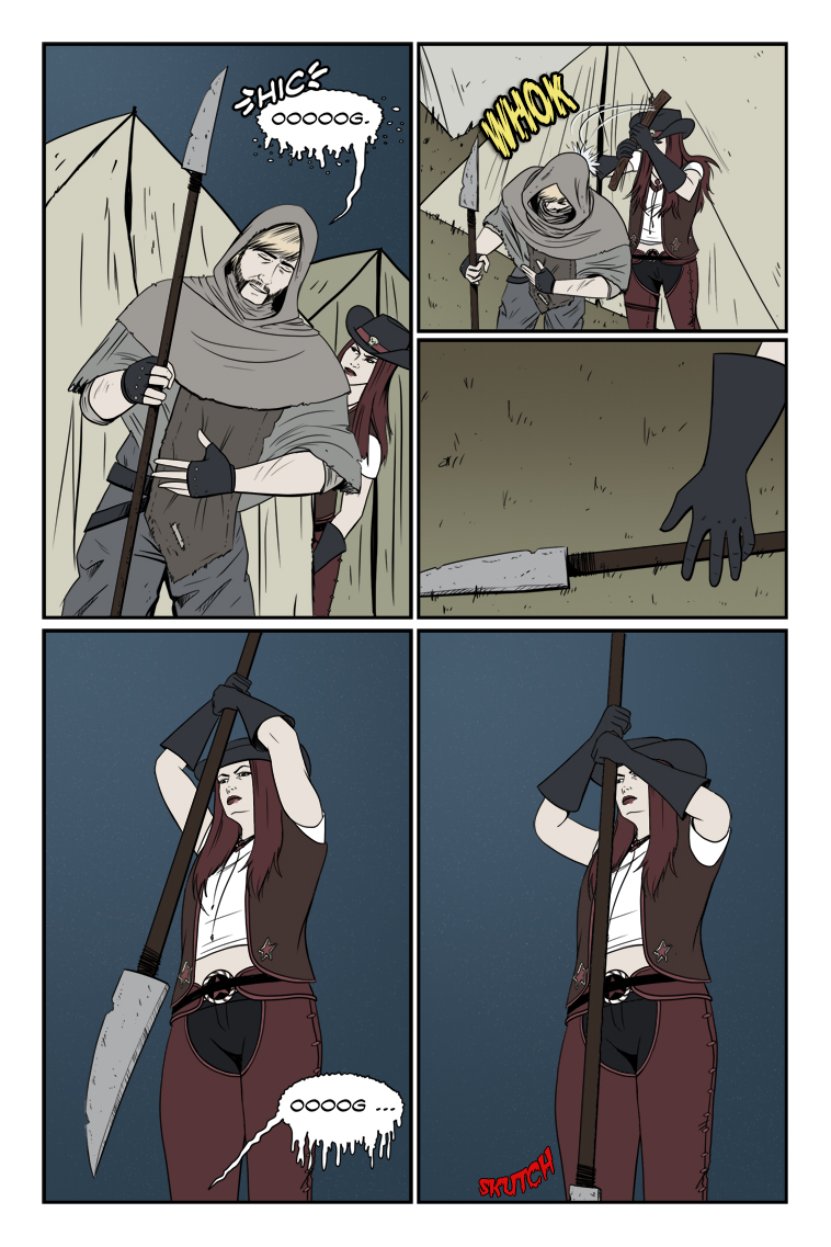
SKUTCH …
Latest Comics
#519. 498 – How Touching
66 Aug 24, 2022
#518. 497 – Sniff Check
72 Aug 10, 2022
#517. 496 – Saved By The Ble-e-gh!
65 Jun 22, 2022
#516. 495 – Deus Ex Caprica
55 Jun 01, 2022
#515. 494 – Once More With Chambering
57 May 18, 2022
#514. 493 – Gun Shy
59 May 04, 2022
#513. 492 – Darkness Crawls
70 Apr 27, 2022
#512. EPISODE TWENTY-ONE
77 Apr 25, 2022
#511. 491 – Surprised Mechanic (END OF EPISODE 20)
55 Mar 02, 2022
#510. 490 – Nope Problem
49 Feb 16, 2022
#509. 489 – Crappy Returns
49 Feb 02, 2022
#508. 488 – Bad Shape
47 Jan 19, 2022
#507. 487 – Got Beef?
56 Dec 15, 2021
#506. 486 – Get The Lede Out
57 Nov 24, 2021
#505. 485 – Proof Of Life
61 May 12, 2021
#504. 484 – Words Of Wisdom
48 Apr 28, 2021
#503. 483 – Solar Systems
51 Apr 21, 2021
#502. 482 – His Body His Business
46 Apr 14, 2021
#501. 481 – Re-capitulation
46 Apr 07, 2021
#499. 479 – Guilty Measure
48 Mar 17, 2021
Latest Chapters
Episode 22
Episode 21
Episode 20
Episode 19
Episode 18
Episode 17
556 – Tip Of The Spear
Doc Lindheimer wouldn't approve. But she ain't here.
Read more in depth info about this comic on Dawn's Patreon (free to everyone): https://www.patreon.com/artofdawn/posts/zombie-ranch-556-161935322
The lettering of the law…
Calendar
BlueSky Latest Posts
Writer’s Blog Archives